
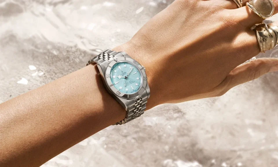
A watch does not have to be covered in elaborate details to attract attention on the wrist. Some of the most effective designs achieve presence through proportion, recognisable shapes, carefully controlled contrast, and a clear visual hierarchy. Rather than asking every component to compete for attention, successful watch design allows a few carefully considered elements to define the overall appearance.
Tudor demonstrates this approach across many of its timepieces. Its watches can appear substantial and distinctive while avoiding unnecessary visual complexity. Understanding how this effect is created reveals why restrained design can sometimes have more impact than decoration.
Case Architecture Establishes The Foundation
Wrist presence begins with the physical structure of a watch. Diameter is only one part of the equation. Case thickness, lug length, bezel width, crown dimensions, and the transition between the case and bracelet all affect how substantial a watch appears.
A carefully proportioned case can create noticeable presence without needing oversized dimensions. Broader surfaces may make the watch appear more confident, while controlled lug proportions prevent the design from looking awkward.
With Tudor Watches, wrist presence often comes from the relationship between these structural elements rather than from adding purely decorative features to the case.
Dial Space Is Used With Discipline
A crowded dial can initially appear impressive, but too many visual elements may make it difficult for the eye to identify a focal point. Strong dial design instead organises information so that each component has enough room to perform its role.
Hour markers, hands, text, and minute tracks can create personality through their proportions and placement. Larger markers may establish a confident appearance, while open areas prevent the dial from becoming visually overwhelming.
This use of space creates impact through clarity. The wearer can recognise the character of the watch immediately without needing to study numerous decorative elements.
Contrast Creates Definition
Colour contrast is another way to increase visual strength without complicating a design. The relationship between the dial, hands, hour markers, bezel, and case can determine how clearly a watch presents itself from different distances.
Strong contrast makes important shapes easier to distinguish. A dark dial against bright markers, for instance, can create a bold appearance while keeping the overall palette restrained.
Examining different models at Burrells can help buyers see how dial finishes and contrasting details respond to changing light in ways that may not be obvious from product photography.
Recognisable Hands Add Character
Hands occupy relatively little physical space, yet they can strongly influence the identity of a watch. Their shape determines not only legibility but also the visual rhythm of the dial.
Distinctive hand designs create recognition without requiring additional decoration elsewhere. When the hour and minute hands have clearly differentiated proportions, they can also make the dial easier to read quickly.
This demonstrates an important principle of restrained watchmaking. A functional component can simultaneously become a defining aesthetic feature.
Bezels Frame The Overall Design
The bezel acts almost like a visual boundary between the dial and the case. Its width, material, markings, and surface treatment can dramatically change how large or compact a watch appears.
A prominent bezel can give a watch a stronger outline on the wrist. Instead of filling the dial with additional details, designers can use this outer frame to create character and proportion.
On watches with functional bezels, this effect is especially useful because the feature contributes to both appearance and utility. Visual impact therefore comes from something that already has a practical reason to exist.
Bracelet Proportions Complete The Appearance
The bracelet should not be viewed separately from the watch head. Link width, taper, finishing, and the way the bracelet meets the case all influence wrist presence.
A bracelet with appropriate visual weight can make a substantial case feel balanced rather than top-heavy. Gradual tapering can also create a smoother transition toward the clasp while maintaining strength near the watch head.
Knowledgeable UK Jewellers can help customers compare how different bracelet and strap configurations alter the overall proportions of a watch once it is actually worn.
Restraint Can Make Details More Memorable
Excessive styling can sometimes reduce the impact of individual design elements because everything competes for attention. Restrained watches take the opposite approach.
A distinctive hand shape, carefully proportioned bezel, recognisable crown, or strong dial layout becomes easier to notice when it is surrounded by visual simplicity. Each feature has room to contribute to the overall identity.
Tudor’s ability to create wrist presence reflects this principle. Instead of depending on ornamentation alone, its watches use structure, contrast, proportions, and functional details to establish character. The result demonstrates that a confident watch does not necessarily need to be visually loud. Thoughtful design can make a powerful impression through control rather than excess.
